SABRIC REBRAND
SABRIC = South African Banking Risk Identification Centre
When my Art director / mentor gave me the assignment to do a big rebrand for a very large organisation back then I knew I would be up for the challenge and took the opportunity to gain some serious industry knowledge and skill.
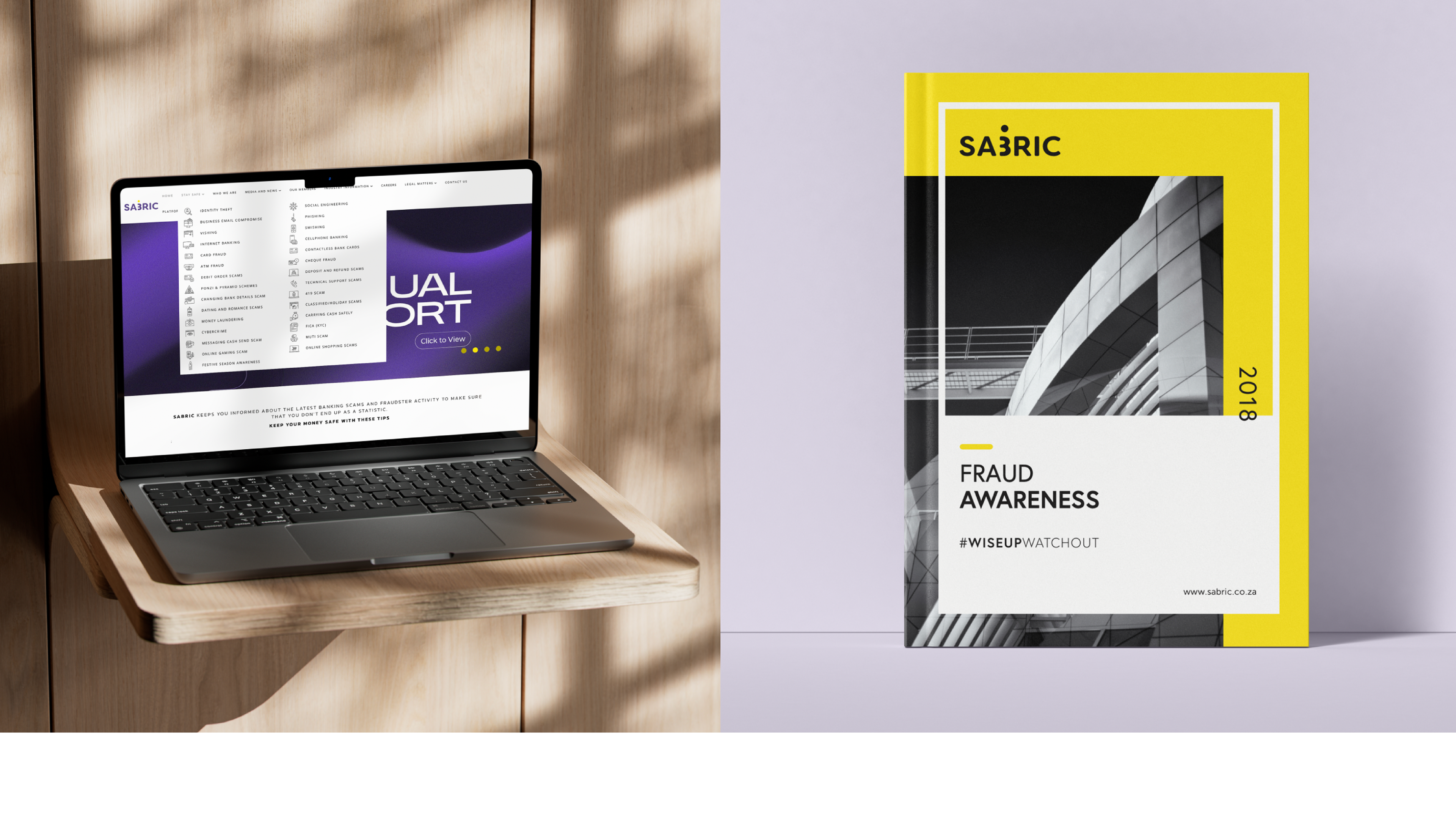
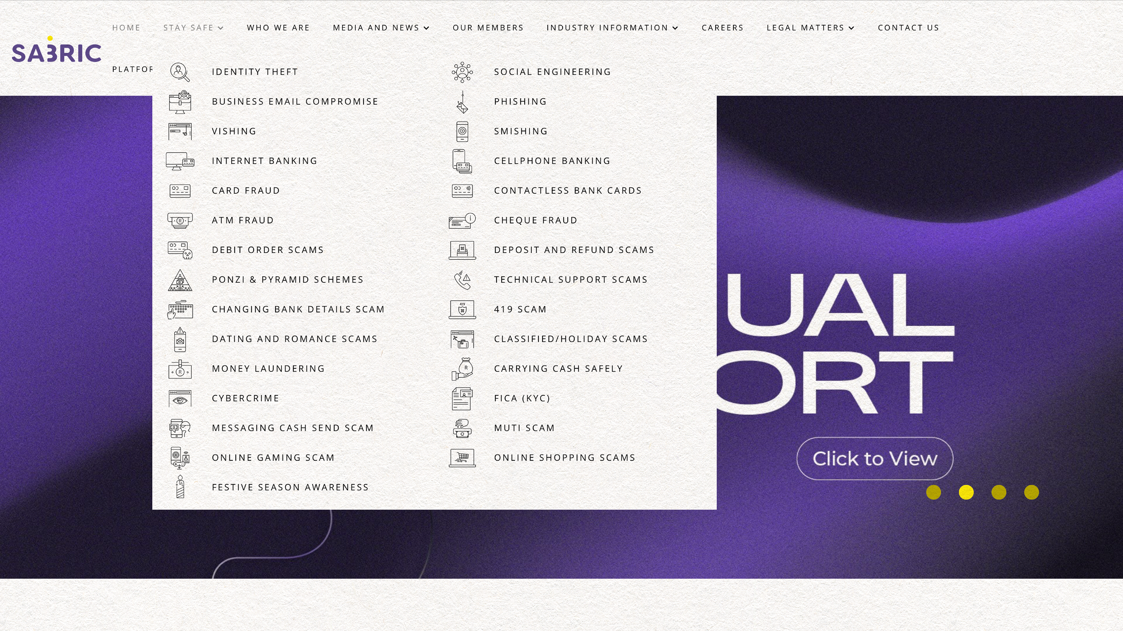
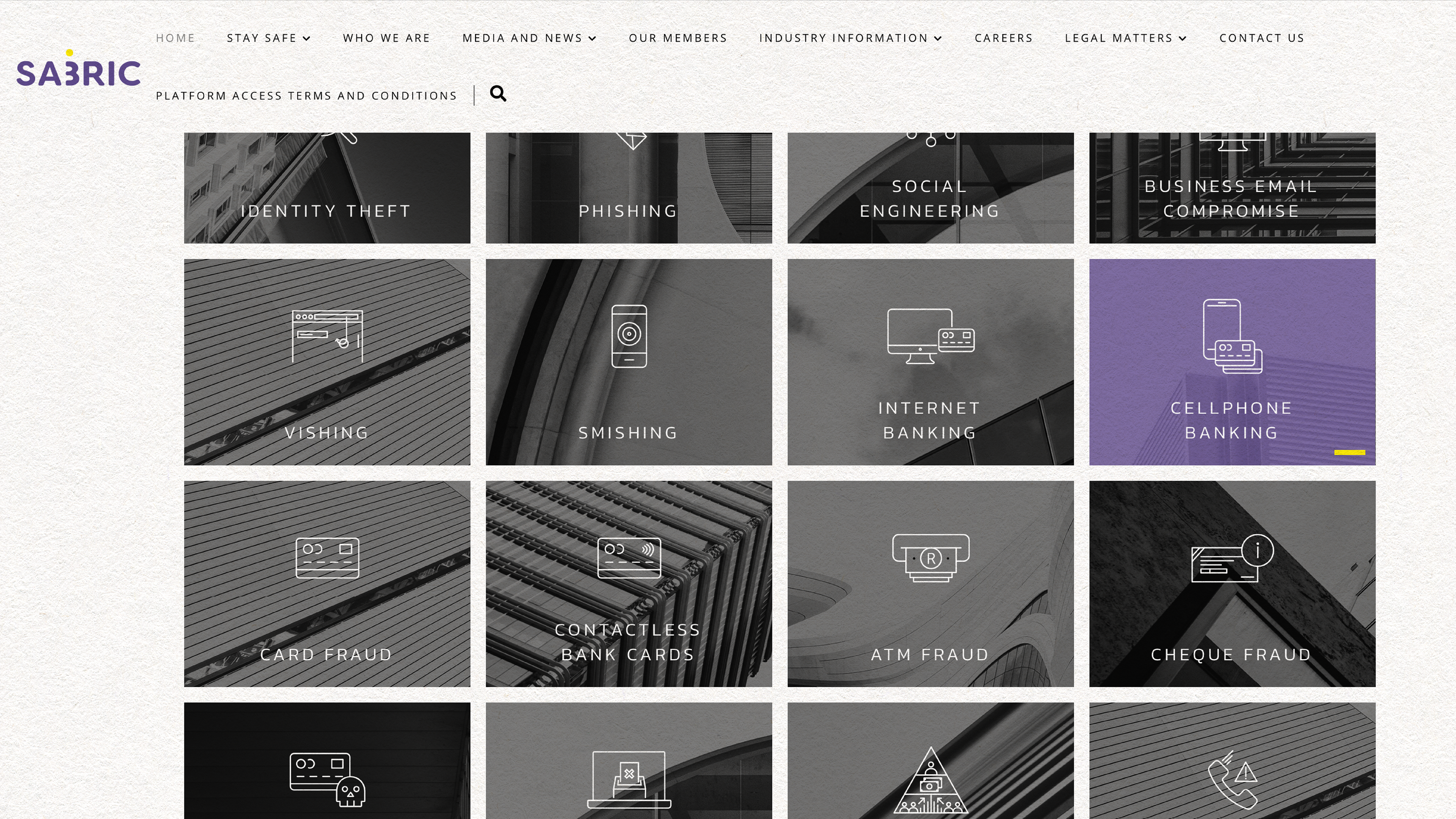
This rebrand was very needed as the previous logo was outdated and the organisation needed some a fresh new vibrant presence. There were so many deliverables to create in the new branding style - including social media campaigns and editorial layouts.
The main concept behind this branding option is Repetition: SABRIC is constantly and on repeat providing info, tips, statistics and assisting the businesses in creating a fraud free South Africa. SABRIC aims to reach and inform as many people as possible. There are always 3 elements in the crime fighting equation. The fraudster, the opportunity that exists and the crime fighting trio : The Business, SABRIC & the people. One against 3.
*As seen in maths when working with the fracture 1/3 : When 1 is divided by 3 the quotient is 0,333..... as the 3 is on repeat the new written way would be 0,3 or 0,3 or 0,3... thus making the number 3 very important in this look. The logo represents SABRIC’s ability to be several things at the same time with the idea of the 3 serving as the B. SABRIC’s new logo suggests repetition by placing a dot-symbol on top of the B which indicates that there are more than one Business. Highlighting the B = Business in this instance, you highlight your stakeholders and the reason for your existence. A bold rounded font was chosen. The never ending option identifies with boldness, smoothness and the infinite ability for SABRIC to shift and flow on repeat, this was paired with a fresh vibrant colour combination one of the colours being the Pantone of the year at the time.